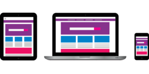 Mobile-friendly web sites were given a big leg up on competitors. Known as “responsive” web sites, these sites instantly adapt to whatever device you are viewing them on.
As users were turning to smartphones and other mobile devices to surf the web, Google realized that most sites didn’t display well on mobile devices. Therefore, Google updated the way they list sites, giving mobile-friendly sites a higher ranking.
Google hasn’t removed all non-responsive pages from its top smartphone listings. But it’s quickly heading in that direction.
According to search metrics, many rankings have suffered as a result.
In addition to getting higher search rankings, responsive sites are easier for visitors to use. Happy visitors engage more, increasing the rate at which they turn into customers.
There are three ways to make your web site mobile-friendly:
1) Build a separate mobile edition that fits small screens and loads quickly.
2) Adapt your current web site design to be more mobile-friendly. In some cases it may be difficult to make such a design responsive on all devices.
3) Convert your current web site design into a responsive one. Going this route, you won’t need a separate mobile version, and you avoid potential penalties from Google for having the same content on multiple domains.
If you want to make things a lot easier, look into a Managed WordPress plan. WordPress will automatically make your website mobile friendly and responsive. It will also keep your plugins up to date and remove any security vulnerabilities issues. Along with the security, backup as done automatically every 24 hours. Our hosting plans is consist of a managed WordPress solution.
Give us a call at 215-723-3495 to talk about more over to a managed WordPress solution or fill out the form to the right.